Step by Step - "Scorpion King"
In this post, i want to show you, one creature, i never posted before on social media. (because the person stopped working on the project.)
A bit of background story before i show the model. So the client contacted me on Twitter at that time when i worked for Wildcard on 3 Dino skins for the game Ark Survival Evolved. It was more of a private client who also worked on his own mod for that game. (Ark has a lot of people who work on mods for the game, which are pretty nice. Some of them get sponsored and get money from it but more often it’s just a hobby for people, and they work on it for free.)
This was actually back in 2017 when my freelance career slooooooowly started.
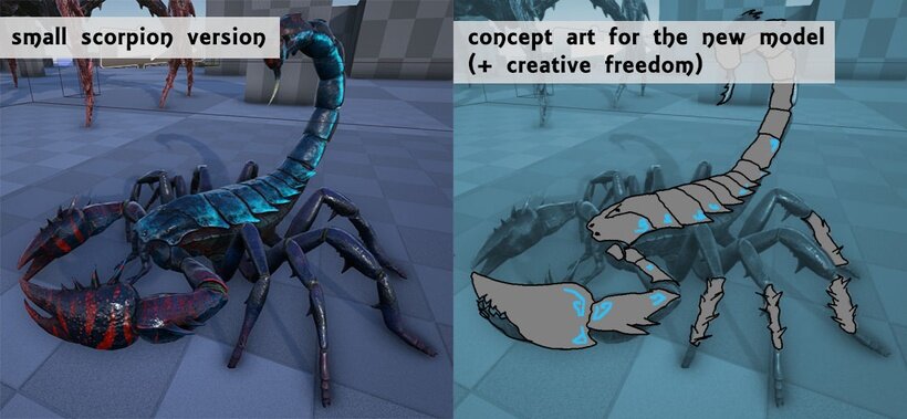
OKAY so here is the concept art or reference the client showed me in the beginning.
The left image is the already existing creature that is in the original Ark game. For his mod, he wanted a scorpion king who lives in a cave. Besides the small overpainting (which you can see on the right), he said to me, that i have a lot of freedom when it comes to designing the bigger version of it.
So the only thing he had in mind was stone plates on the body plus some glowing ornaments carved into the stone. The good thing was, that i got the base model of the smaller scorpion, so i didn’t need to start from 0. It’s always better to start from a basemesh to speed up the workflow.
🡫
The first step i did was just pushing and pulling the form and finding a nice overall idea for the king creature. I thought in comparison to the small scorpions and to symbolize that this one is stronger and high in level, i needed to make sure that the shape is more dangerous. And that was the point of bringing 3 tails in.
Legs are still in base mode at that point, but i worked on the stone plates on the back and also wanted to bring in some asymmetry to the front claws. That’s why one is bigger than the other side. I also started to put in some details already.
🡫
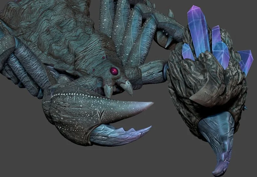
The next step was just giving everything more detail and form. Also, the client wanted some changes to the stone backplates. The ones i did before were too clean. But the whole scorpion should look more natural, so the stones needed to be grown more naturally as well. The other part i was working on, was the left front claw, which is bigger. Adding some crystals to it made me realize, that the stones need to grow in the same direction as the crystals, to bring a good flow to the whole claw.
🡫
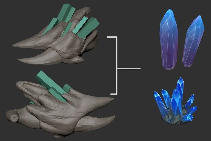
For the crystals, i had in mind something like this. Simple hand-painted crystals. The blocks were just placeholders at that moment, which i shaped more later on (image above).
🡫
After the rest was done i focused on the last part, the legs. Looking at it now, it would have been better, if the legs would look a bit different per section. I just did one leg and copied it over for the other 7 legs, which kinda looks okay, but if you want to go to another level, then make each leg (at least the 4 in the row) a bit different. I did the same with the tail. I just sculpted one and copied the other 2 over.
The good thing is you can just sculpt and paint one part to speed up the workflow. But as i said, it would be better when you make a bit more variety in the creature.
After the copied pieces i was fully done with the sculpting.
🡫
The next part was one of my favorites because i had the freedom of choosing the colors for this creature. I kept in mind, that this scorpion lives in the caves, mostly in the dark, so natural colors (in this case, gray stone colors), were the right way to go. But to make it a bit more interesting i added two more colors. Blue color to make it a bit more light compared to the gray, and some purple for the crystals. There is also some red in it, but that was made to symbolize the bloody fleshy skin underneath.
I did all the colors with poly paint and by hand with a normal standard brush and the cavity masking. Using cavity masking for poly paint is quite useful when you have deep scars, holes, or when you made high scales.
🡫
After turning off the cavity mask, i painted some light highlights on the edges to make it more pop. When you do a more stylized art and hand painted texture, just keep in mind that every time you have a dark scar, notch, holes, or anything that is deeper in the mesh, then take a lighter color and go along some edges to make the dark color more effective.
🡫
The last step of painting was to bring in some ornaments on the stone’s skin. I didn’t get any references from the client so i just improvised the symbols. Later on, when you do the texture, you can easily mask the symbols to make them glow with a map. To make it look even better, i tried to paint some glowing cyan into the stones where the crystals are sitting. This makes it more magical and brings the stone a bit more alive.
You also can see which parts are copied. (yellow color)
🡫
The last step, which i actually didn’t need for the client, but more for my own project to show this model in a more active way (if i ever make it public), was to pose this creature. i wanted to make it in a more aggressive attacking way.
The thing you have to keep in mind when you pose creatures is to make them asymmetrical and to also focus on the little details. Even when it’s just a tiny rotation or bend, this makes a whole pose so much more alive. It’s a bit harder to make that for insects because they can’t show much personality (only when it’s a cartoon character), but overall take your time with posing.
🡫
▪️ ▪️ ▪️ ▪️ ▪️ ▪️ ▪️ ▪️
And that’s it.
I definitely would do a lot of things differently than i did at that time, (a few years ago since i worked on it), but i really liked the idea behind it. It’s hard to look at old artwork because you always find things you can do better now. :D well, try not to focus too much on that, or you would feel bad.
Here is a little shot of the in-game model. (which never made it into the mod game but who knows) ;)
🡫


